Basic Blocks
Find the basic blocks you need for your page here
1- Container
This block is used to contain text and images added via the “Image” block. Don’t put any other block inside the container unless it’s text or the “Image” block
Features
- Option to change the background color
Example
Here’s how the block looks in the backend:

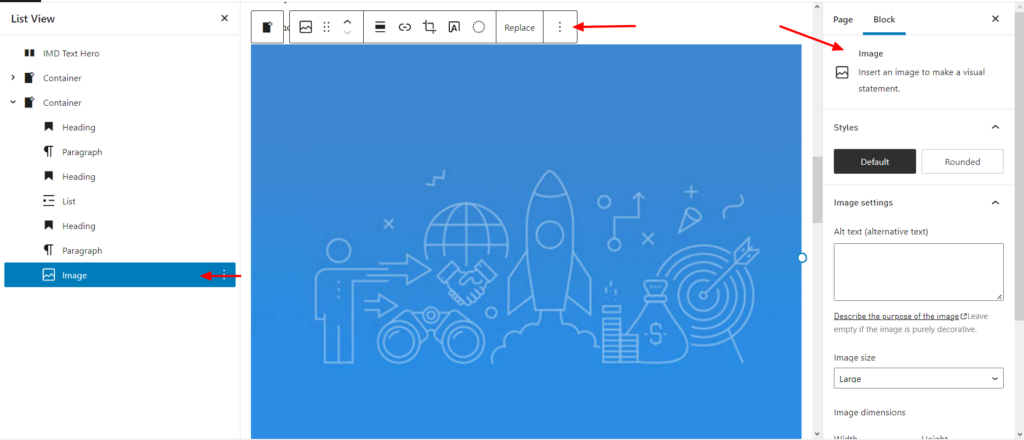
2- Image
This block is used to add an image.
Features
- Alignment options
- Option to add a link in the image
- Various options to control the size and styling of the image
Example
Here’s how the block looks in the backend:
3- Buttons
The buttons block has various button styles. See the examples below.
Features
- You have the option of showing form/workflow
Example
How to add form/workflow to the button
- Once the button is added to the page, click on it
- On the right side bar, click on “Show form in a modal”
Please note, once adding a link to the description field of any block, there is a new option called “Button” which allows showing link in blue and it has an arrow.
4- List
Use the list block to add bullet points.
Example
With dots:
- Find an alumni community in your area
- Attend virtual and in-person events to share knowledge and gain insights
- Benefit from career coaching or post a job or internship opportunities
- Participate in the International alumni event
Numbered bullet points:
- Search and connect through the Alumni directory
- Connect and expand your reach on IMD Hive
- Learn and get inspired by I by IMD
5- Columns Row
Use this block to add columns to a section. Inside the columns, you can add text, images, embed videos, and more. This block needs to be inside a container.
How to use the block
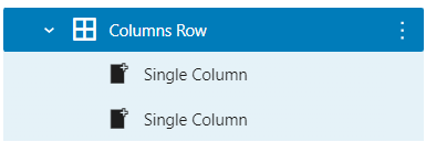
Once you add the block, click the “+” sign to add more columns

Each column you add will create a “Single Column”. The Columns Row acts like a container that holds Single Columns.
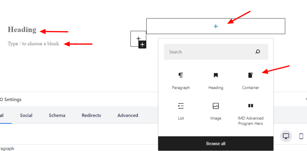
You can click the “+” to add blocks inside each Single column.
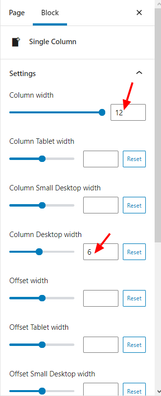
If you click on the Single Column, you can edit settings on the right sidebar.
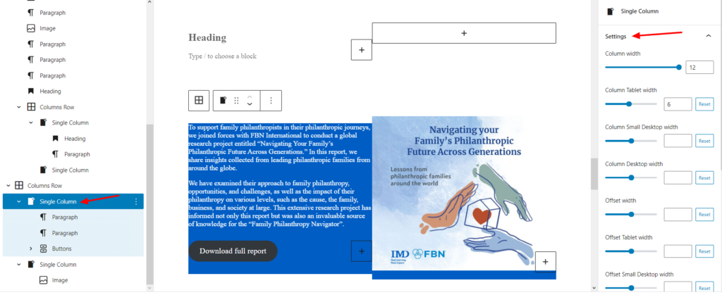
The sliders in the settings above control the size of the columns. With these option you can optimize the columns for all kinds of devices. For example, if we leave the the default columns settings in the example below, it’ll look good on desktop, but it will not be optimized for mobile devices.
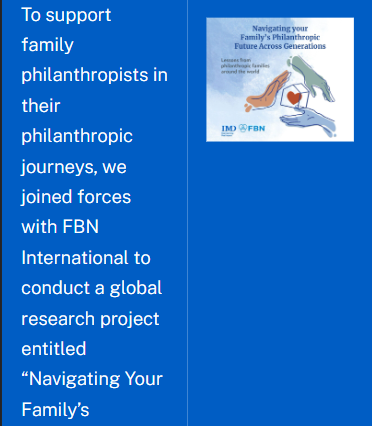
However, if we increase the “Column Width” to 12, and keep it as 6 in “Column Desktop Width”, this will keep the 2 columns layout in desktop while creating one column in mobile, which is a much better user experience.

Example
Navigating Your Family’s Philanthropic Future Across Generations
A research report in collaboration with FBN International that highlights how philanthropy becomes a lifelong passion as families start to see that they can make a real difference in the world.
To support family philanthropists in their philanthropic journeys, we joined forces with FBN International to conduct a global research project entitled “Navigating Your Family’s Philanthropic Future Across Generations.” In this report, we share insights collected from leading philanthropic families from around the globe.
We have examined their approach to family philanthropy, opportunities, and challenges, as well as the impact of their philanthropy on various levels, such as the cause, the family, business, and society at large. This extensive research project has informed not only this report but was also an invaluable source of knowledge for the “Family Philanthropy Navigator”.

Key takeaways
- Apply a holistic and comprehensive view of family philanthropy that fits with the purpose and inner workings of the family
- Nurture relationships and collaborations within and outside the family
- Leverage the resources and governance practices of the family enterprise system to better serve your beneficiaries
- Strengthen extended learning opportunities to test, validate and adopt effective approaches to impact
- Reflect on the viability, feasibility and desirability of your philanthropic plan by prototyping your idea early on.
6- IMD Responsive Images
Use the list block if you have an image with multiple versions for each device. For example, if you have an image of a table with 8 columns, that’s too big for a mobile device. So, you may have a version of that same table optimized for mobile. In this case, use this block to showcase each version of the image in a suitable device.
Features
- You can upload three image sizes:
- Big Image: For desktop
- Medium Image: For tablet
- Small Image: For mobile
- Alternative text (Alt text) field
- Caption field
Example
To fully experience the example below, please view it in both desktop and mobile.

7- Separator
This block is a simple block that functions as a line between sections.
Features
- Choose from the 3 following styles:
- Default line
- Wide Line
- Dots
- Choose the separator color (labelled as “Background” in the backend). You can select the color from a color pallet color.
Example
Style: Dots
Style: Wide
Style: Default